HRI Munro
Category
Interface Design - Incorporating: website, mobile and app design
Company
FortyTwo Studio
Client
HRI Munro
Summary
HRI is an award-winning Scottish architecture practice with precedents covering commercial, residential and renewable projects.
With recent internal restructuring, there was a need to update and improve not only the website but what the practice stood for.
Working closely with the senior team and founders of the practice, we created a new brand strategy, position and messaging system and created a concept for the new site that delivers a clear practice track record, as well as allowing the team to set out the key values behind their practice.
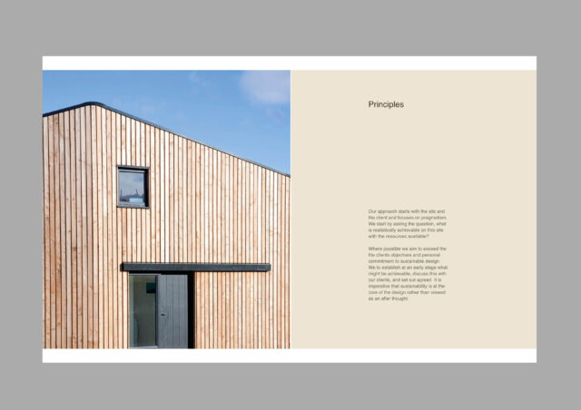
The new website was designed to allow users to take their time while browsing, with minimal typography layouts and large showcase imagery delivered on scroll, meaning the site doesn’t feel rushed.
The simple 4-column grid can be adhered to or broken, letting the content and the HRI team dictate page layouts. This customisable page layout is controlled in Craft CMS and allows every item, text and image to be individually managed.
We created simple yet highly effective elements throughout the site which give users a feeling of interactivity and site feedback without inviting too much clutter or movement. Interactive lists for the Awards sections (Studio) and Keyword text blocks for the Ethos module (Approach) help bring the restrained design to life.
This economical design is a direct reflection of HRI Munro’s dedication to simplicity, form and sustainability.
With HRI regularly working on long term public contracts, project lifecycles can be long and opportunities hotly contested. As such its not volume leads they look for, it's qualified enquiries. After 1 month of the new site being live, one such lead directly cited the website,and its content as the reason for their approach.
"We approached FortyTwo Studio to carry out a re-design of our website and brand identity last year. We had an existing website that hadn’t really changed for a number of years and was looking a bit tired, so we decided we needed a fresh new approach to the design and FortyTwo Studio’s portfolio really impressed us. As part of our redesign, we wanted to highlight our track record in sustainability and timber technologies, and make sure we were approachable to both commercial and residential clients. Mark and Sam carefully navigated us through the whole website design process, helping us understand our brand identity, and explaining the importance of messaging and tone of voice.
We are extremely pleased with the finished website design – it is bold, feels fresh and aligns perfectly with how we view ourselves as a practice. FortyTwo Studio nailed the brief!"


