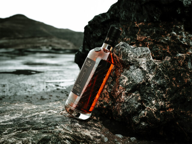
Halcyon Spirits
Category
Packaging
Company
FortyTwo Studio
Client
Halcyon Spirits
Summary
Modern, minimal and mysterious - they were the first words on the brief.
We were commissioned to design a new independent bottling brand and bottle system for the new breed of whisky collector — a fast-growing and youthful audience. Halcyon Spirits' initial collection was to feature some of the most rare and celebrated Single Malts available today, each one commanding a significant value, so it was crucial that the brand and bottle carried this ultra-premium position, with individual releases numbering in only hundreds of bottles.
The brand draws directly on the owners' family history within the Scottish fishing industry. They wanted clear, tangible links to the family's upbringing and legacy.
Named after their grandfather's fishing boat "The Halcyon" which sailed out of Macduff Harbour on Scotland's Moray Coast, we created a custom monogram logo mark, based on the familiar shapes found on quayside moorings.
The bottle features a branded porthole coin embellishment and a full-wrap tactile high-build varnish, reminiscent of nets used by traditional Scottish herring fishermen — used by their family for over three generations.
The label keeps pace with its high-value releases, using single gold foil finish and select emboss on Tintoretto Black Pepper by Fedrigoni. Deliberately restrained and elegant, leaning away from all the trappings of traditional Scotch Whisky labelling, the bottle and label stand apart from the competition.


