The Rebel Baker
Category
Brand Identity - Consumer
Company
Mick McCabe Design
Client
the Rebel Baker
Summary
The Rebel Baker and her Rebel Bakes, where innovation meets inclusivity. We proudly offer a Top 14 Allergen Friendly range, ensuring that everyone can indulge in our rebellious treats without worry. Our brand is more than just a baking venture – it's a bold challenge to convention and a celebration of extraordinary confections.
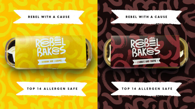
Our brand ethos is vividly captured in our logo, where the letter 'e' in "rebel" transforms into a delectable cake, symbolising our unwavering commitment to crafting indulgent delights. Meanwhile, the 'e' in "baker" gracefully morphs, evoking the mesmerising motion of mixing and whisking cake batter. This playful integration of elements speaks volumes about our dedication to pushing boundaries and unleashing limitless creativity.
When it comes to our packaging design, we draw inspiration from the vibrant colours of the ingredients used in our cakes. Each package is meticulously crafted as a canvas for bold hues and playful patterns, reflecting the diverse flavours and textures of our creations. Through this vibrant visual language, we aim to captivate the senses and ignite curiosity, inviting customers to embark on a tantalising journey of taste and visual delight.


