Planning Aid Scotland
Images


Videos
Direct link: https://www.youtube.com/watch?v=e9D7OG1T9y4
Direct link: https://www.youtube.com/watch?v=YiIBUr56zRk&feature=youtu.be
Category
Brand Identity - Civic
Company
Bold Studio
Client
Planning Aid Scotland
Summary
Planning Aid Scotland is a charity that helps people navigate the planning system empowers communities to shape places in a positive way. They also have an outreach programme that educates and engages people on the planning system. They harness the power of some 400 specialist volunteers across planning and architecture to deliver the service via an education programme and advice line. Their vision is one of an inclusive society where people are at the heart of decision-making about their places.
The Brief:
The organisation needed a contemporary identity to blow away the cobwebs and show show it as a relevant and vital part of a modern, democratic and progressive landscape. The client was keen for a fresh approach and pro-active throughout the process.
The solution would lie between communicating their specialist expertise and their approachability and community focus. We were keen to find a synergy between the needs of industry professionals, governments and community members.
Challenges:
The workshop process revealed a naming issue – although referred to as PAS within the industry, the abbreviation didn't mean anything to the target audiences they were trying to reach. However, with 30 years experience behind them, we had to find a way to maintain their brand equity. The result was to go with Planning Aid Scotland which would help them become more visible to people outside of the bubble.
The Solution:
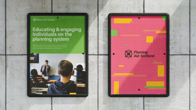
We created a logo system that is structured and technical in appearance, referencing the work of Planning Aid Scotland by drawing on elements of the practice and their progressive outlook.
The logo is made up of three elements that relate directly to the name - the graphical shape represents technical blueprints, the plus represents aid or assistance and the saltire representing Scotland is also subtly referenced.
The mark draws upon technical references but the colour palette and grid pattern juxtapose this, the colours are friendly and contemporary. We adjusted elements of the type to correspond with the logomark by neatly cropping corners to bring the system together.
Impact:
We equipped Planning Aid Scotland with a brand system that will support them to achieve their aspirations for the future, empowering more people to engage with the topics and decisions that affect their lives by representing the organisation as welcoming, modern and positive. We also created a special mark and numerical typeface to mark the organisation’s 30th year.
