BARD Brand Identity
Images


Videos
Direct link: https://vimeo.com/927629587
Direct link: https://vimeo.com/927577517
Direct link: https://vimeo.com/927577556
Direct link: https://vimeo.com/927577725
Direct link: https://vimeo.com/927577656
Direct link: https://vimeo.com/927577690
Direct link: https://vimeo.com/927577614
Direct link: https://vimeo.com/927577765
Direct link: https://vimeo.com/927633164
Direct link: https://vimeo.com/927577791
Direct link: https://vimeo.com/927577895
Direct link: https://vimeo.com/927578001
Direct link: https://vimeo.com/927578186
Direct link: https://vimeo.com/927577403
Direct link: https://vimeo.com/927620140
Category
Brand Identity - Business
Company
Warriors Studio
Client
BARD
Summary
BARD, an award-winning architecture practice and the only architects entrusted with building on Charles Rennie Mackintosh’s legacy with their work at Windyhill, reached out to us to discuss improving how their practice is presented:
“Our website and communications were built in-house, however were not effectively communicating our desires, aspirations, or capabilities. The quality in our own architectural outputs was there, but the bridging link in conveying this was broken.
We interviewed several studios and quickly took a liking to Warriors. They immediately caught on to what we were looking for and beyond. Their strategy proposed was fresh and intriguing and we really wanted to be on this journey with them.” Ruairidh Moir, BARD
As often with our work, the goals were about balancing strategic business objectives with artistic and creative richness.
We worked with BARD to build a brand which presents the business professionally, while conveying the original qualities, unique vision and poetic approach of their team.
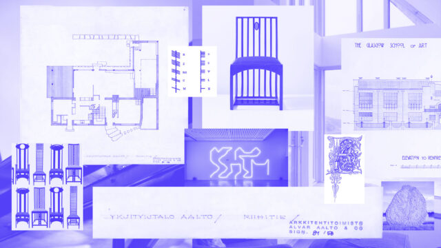
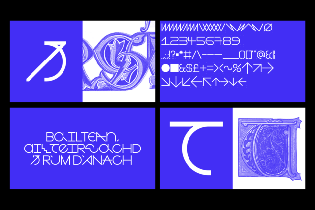
At the heart of the identity is a custom typeface we designed in collaboration with Mitchell Gillies, inspired by the legacy of Charles Rennie Mackintosh, medieval lettering, architectural drawings and pushing creativity within limitations, reflective of how BARD approach each of their projects.
The custom type in the identity includes a rethinking of accents especially for Scottish Gaelic (Gàidhlig) respecting the Celtic roots of the practice.
Within Celtic cultures BARD can mean storyteller, maker, poet so we wove this through every aspect of the identity.
From a Hebridean wild flower colour choice, concrete-poetry inspired composition, collaborative verses offering insights into BARD’s world, typeface combinations which represent different forms of writing, storytelling and language. Every aspect of the brand is carefully considered and reflective of who and what BARD are.
“We love it, and feel a deep sense of pride when we see it and interact with it. It reflects a BARD which was not seen previously. It’s beyond what we could have imagined or hoped at the outset.
It has given us a confidence boost and demonstrates a level of maturity of where BARD has grown to through this process.
They truly got to know us, and set the foundations for everything that followed. The development of the brand identity and all outputs all addressed the vision of BARD that was to come.” Ruairidh Moir, BARD
Featured on It’s Nice That, Brand New, Type Room, Urban Realm and Scottish Construction Now.
Website filming, storyteller video and photography shot by Alex James.
